

Essential Insights
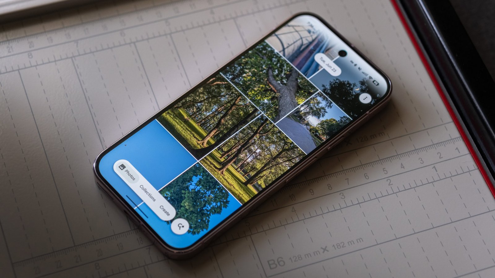
- Google Photos has updated its navigation bar to a floating, pill-shaped design, making the interface more modern and efficient.
- The new, smaller nav bar remains fixed during scrolling, providing clearer and more predictable navigation, with the search function accessible via a circular button.
- This change aligns Photos with newer UI trends but diverges from Google’s Material 3 Expressive guidelines, which still favor ribbon-style nav bars in most apps.
- The revamped design is seen as less obtrusive and more intuitive, suggesting a potential shift towards wider adoption in Google’s app ecosystem in future updates.
Embracing the Modern Design in Google Photos
This week, Google rolled out a fresh look for Google Photos on Android. The app’s navigation bar changed from a familiar ribbon to a sleek, floating pill shape. This small update may seem minor, but it makes the app look more modern. With the new design, users find it easier to navigate. The updated navigation bar fits better on the screen, freeing up space for photos and albums. It also feels more predictable, which helps users move smoothly between sections. These changes show Google’s goal of improving user experience through cleaner, more intuitive design. Such updates signal Google’s focus on keeping apps current and user-friendly, encouraging others to follow suit.
Enhancements That Make a Difference
The new navigation bar offers noticeable improvements. It is smaller and more space-efficient. Instead of occupying a large area, it now uses a pill shape that hugs the bottom of the screen. This saves screen space, especially important on smaller devices. Additionally, the bar stays fixed even as users scroll through their photos. In the past, the old navigation bar disappeared when scrolling, which could cause confusion. With the new, fixed design, users always know where they are within the app. The search button now appears as a separate circular icon to the right. Tapping it slides in a dedicated search view, making finding photos quicker and easier. Overall, these changes create a more seamless and satisfying experience for users.
Broader Implications and Future Possibilities
While Photos is getting this modern refresh, other Google apps still use the older ribbon-style navigation. Apps like Gmail, YouTube, and Maps continue with their traditional designs. However, the new pill-shaped navigation bar is gaining popularity outside Google too. For example, some apps now feature floating, fixed-position bars for better usability. This trend reflects a shift toward more adaptable, minimalistic UI elements. Still, Google’s move also raises questions about consistency across its platforms. The new design doesn’t yet fully align with Google’s Material 3 Expressive guidelines. For example, some apps only include two options in their navigation bars, instead of three to five recommended. Despite this, many find that the cleaner look and intuitive operation make the new Photos nav bar a step in the right direction. Hopefully, wider adoption of this design will usher in a more cohesive, user-focused experience across all Google apps in the future.
Discover More Technology Insights
Explore the future of technology with our detailed insights on Artificial Intelligence.
Explore past and present digital transformations on the Internet Archive.
CellphonesV1
