

Fast Facts
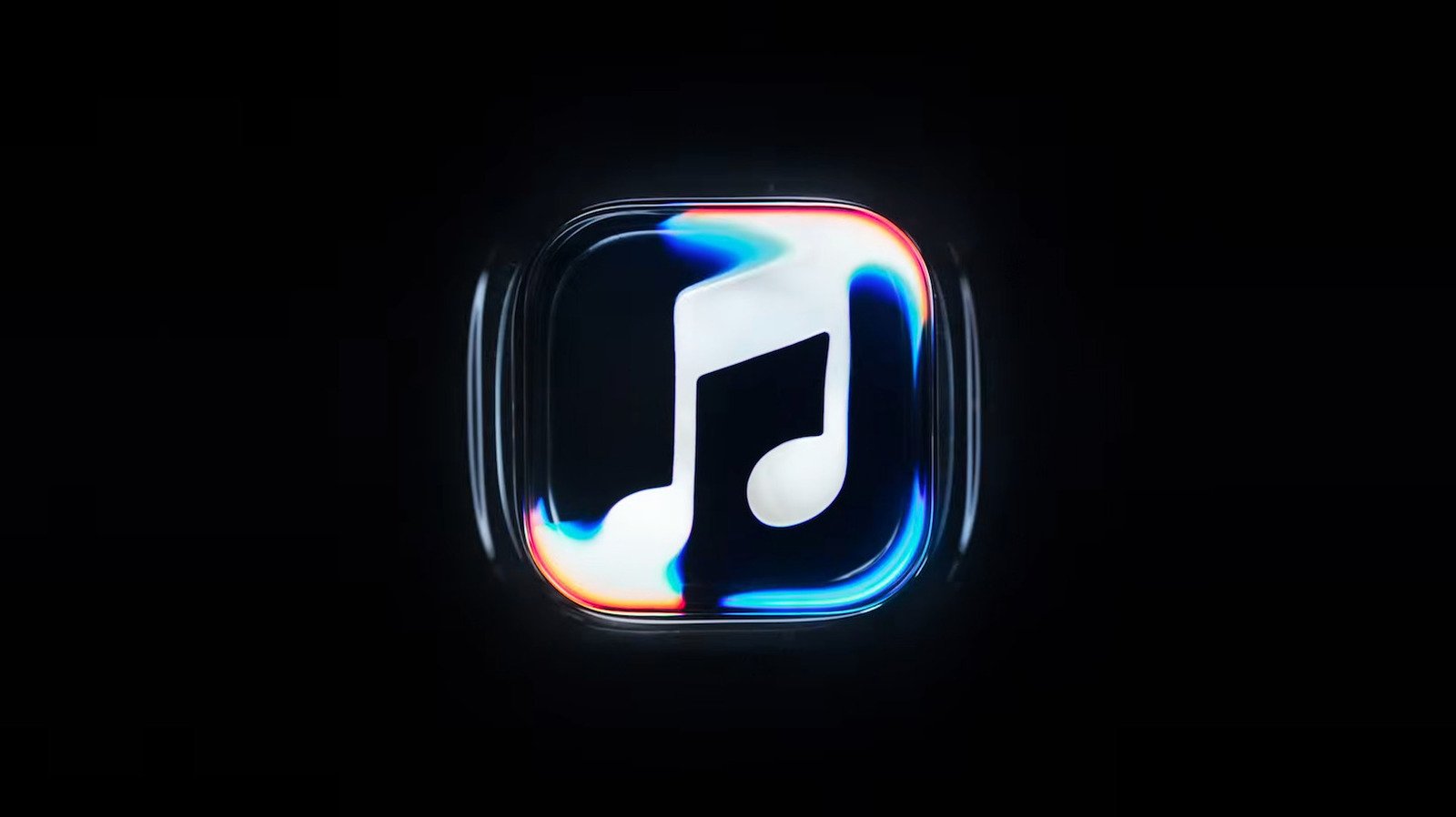
- Apple unveiled a new Apple Music logo: a musical note beneath rippling waves, designed to complement Liquid Glass.
- The visuals were created with practical effects, using sound to ripple mineral oil over a glass-etched logo.
- Apple developed the design with music producer Fred Again and NEST Acoustics to turn sound into visuals.
- The animated logo will appear in music videos and concert footage; a black-and-white app icon is also coming with iOS 27.2 and macOS 27.2.
There’s a New Apple Music Logo, and It Looks Like Ripples in Water
A musical note meets moving water
Apple Music has a new visual identity, and it starts with a simple image: a musical note beneath rippling waves. The effect feels fluid and calm. It also fits Apple’s Liquid Glass design language, which uses layered, translucent visuals across its software.
But this logo does more than suggest water. Apple wanted sound to shape the image itself. To create the effect, the team etched the logo into the glass floor of a small tank. Then it added mineral oil and placed a clear cover over the design. A short series of tones sent ripples across the oil. The team filmed those movements and turned them into a visual mark.
That hands-on process gives the design a human touch. Instead of relying only on digital effects, Apple used sound, light and a physical space to build the animation. The result links music and motion in a way that listeners can understand at a glance.
The animation adds atmosphere, not new music tools
Apple plans to use the moving logo at the start of Apple Music videos and concert footage. That could make music clips feel more unified, whether someone watches a polished video or a live performance. The animation may also help the service establish a clearer identity across its visual content.
Still, this update focuses on presentation. Apple has not announced new listening features alongside the logo change. So, subscribers should not expect the ripple effect to alter how they find, stream or organize music.
That distinction matters. A refined visual can make an app feel fresh, but it cannot replace practical improvements. For many listeners, playlists, recommendations and reliable playback shape the everyday experience far more than an opening animation. Even so, a thoughtful design can add character to the moments around the music.
A bold icon change may divide listeners
The animated logo and the app icon take different approaches. The animation uses rippling movement, while the updated icon shifts from red to black and white. That cleaner palette may sit naturally beside the Liquid Glass interface. However, some people online have already criticized the change.
Their reaction makes sense. App icons serve as familiar landmarks on a phone screen. A new color scheme can look modern, yet it may also feel less distinctive to people who recognize Apple Music by its red mark. The design offers a fresh look, but taste remains personal.
Apple plans to bring the changes with its next software releases, including iOS 27.2 and macOS 27.2. If the new identity rolls out as described, listeners will see a service that connects music to motion in a more direct way. The ripples offer a memorable visual idea. The monochrome icon, meanwhile, asks users to embrace a sharper change.
Expand Your Tech Knowledge
Dive deeper into the world of Cryptocurrency and its impact on global finance.
Access comprehensive resources on technology by visiting Wikipedia.
CellphonesV1
